Light: Science and Magic – Book Review

I’ve reserved copies of the recommended reading material through my local my library, and it’s been interesting reading some of the books. This one was a long time in arriving and I only got to keep it for 3 weeks; it was already reserved by another user before I could even renew it once. I was sceptical about this book having been left very disappointed with ‘The Photograph as Contemporary Art’, which I intend to also review.

This book has been a revelation for me.

It starts with a not-too-complex introduction to the physics of light, describing its’ scientific characteristics. I found this approach quite unusual, as most books on photographic lighting I’ve come across have never tackled light in this way. I was intrigued by the author’s strategy, and quickly realised this was something special. After a brief explanation of the sensitivity to light of camera sensors vs the human eye, he describes light according to photographers.

This includes a photographer’s use of terms such as brightness, colour and contrast. He then moves on to Light vs Lighting and elegantly describes the variables that affect the subject being lit. He covers reflection of light, and what he terms ‘the family of angles’. This term underpins much of the excellent practical ways that subjects are lit, with detailed coverage on lighting different types of surfaces. He deals at length with metal, which poses unique challenges when it comes to lighting.

He moves onto portrait lighting and manages to describe this in some of the best ways that I have come across. Throughout the book he has a lighthearted, friendly approach to describing stuff that has not always been tackled in the most engaging way. I’ve included a link to a tutorial on portrait lighting that I found to be hard to grasp. Another decent lighting tutor I’ve come across is Neil Van Niekerk, a South African commercial and wedding photographer. Apparently Strobist, the well known lighting blog, are also a fan of this book, so I’ve included their review of the Third Edition.

In summary, this is probably one of the best introductions on lighting currently available. Unfortunately the principle author passed away late last year, so I don’t know if another edition will be published. However, I would highly recommend this title and intend to purchase a copy.

Hunter, Fil et al, (2009). Light: Science and Magic. An Introduction to Photographic Lighting, Focal Press.

Click to access PBase.pdf

http://strobist.blogspot.co.uk/2007/04/get-creative-with-little-light-s-and-m.html?m=1


Response to Assignment One feedback

I must say I am really struggling with a few things blog related at the moment! I can’t for the life of me figure out how to change my menu layout so I have a drop down system. This is taking up far more time than necessary! Anyway, I’m hoping that by posting this feedback, I can move onwards and (hopefully) upwards as far as the course is concerned.

My tutor Helen has provided some much needed and valuable feedback to get an idea of how I’m doing in terms of the assessment criteria. The following I thought were the main take aways from her feedback:

“Encouraging levels of technical ability”.

“Experimentation with a range of visual techniques and devices”.

“Variety of images in different genres”.

“Must improve contextual written work, research documentation and reflections on Learning Log”.

“Minimise post-processing at this stage”.

This was all very encouraging and I am hoping to take this feedback and continue to apply myself in similar manner going forward. Helen thought the strongest contrast was: ‘One/Many’ and the weakest was ‘Still/Moving’. I agree that ‘Still/Moving’ was weak in terms of conveying stillness in the picture with the boat. Although I was aware that this boat is permanently moored, it is something that the viewer would only be aware if told. I had considered going to take some pictures of the ‘living statue’ performers along the Thames in Waterloo. This would’ve been a perfect complement to the Dervish as both are street performers. Shame!

I really need to get some study visits, book reviews and other writing up onto my blog. I’ve completed reading the excellent ‘Light, Science and Magic’, and hope to review it shortly. I think its the best book on lighting I’ve read so I look forward to reviewing it. On the other hand, ‘The Photograph as Contemporary Art’, left me confused and depressed!

As Helen explained in her feedback, critical reading and research will… “provide evidence of improvement of understanding of wider photographic practice”.

So overall, I feel I’ve made a good start to the course, but I really need to increase my blog output so I can continue to make good progress.

Butterfly in Kew Gardens

Butterfly in Kew Gardens

Many Boris Bikes: I used one of the shots I had taken as part of the focus assignment. The bikes seem perfect to demonstrate many items.

Many Boris Bikes: I used one of the shots I had taken as part of the focus assignment. The bikes seem perfect to demonstrate many items.

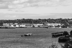
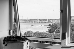
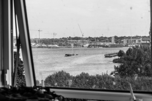
The boat in this picture is permanently anchored in this location so other boats can moor themselves if they need to. I think the black and white also emphasises the static nature of the shot.

The boat in this picture is permanently anchored in this location so other boats can moor themselves if they need to. I think the black and white also emphasises the static nature of the shot.

This is a Dervish performing in Nama Bay, Egypt. I think the shot encapsulates rotating movement in its purest form!

This is a Dervish performing in Nama Bay, Egypt. I think the shot encapsulates rotating movement in its purest form!


A sequence of composition

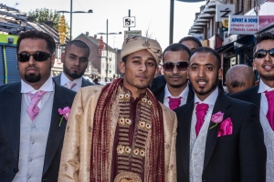
This exercise is designed to help you think about the practical process of composing an image. I made several attempts at getting a sequence together, including a Sunday market and a walk in the park. This posed several problems not least of which was being able to compile a cohesive sequence of images, which I came across in most outdoor settings. Many people don’t behave naturally when they know they are being photographed, as it wasn’t always easy to be discreet with my equipment. Perhaps a longer telephoto lens would’ve helped me to accomplish this, but then they do tend to be much larger! I am quite a shy person at first, so maybe if I was more able to break the ice with strangers I could get them to pose more naturally. However, I found it easier to get very good ‘storytelling’ images when there were willing volunteers. I was asked to shoot a wedding for a friend of a friend, and I felt this was a perfect opportunity.

A sequence of composition-6 A sequence of composition-5 A sequence of composition-4


A sequence of composition-3

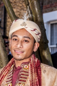
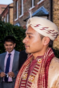
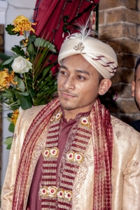
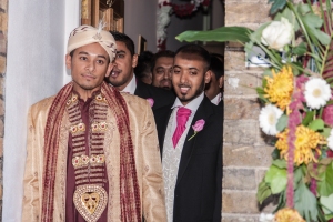
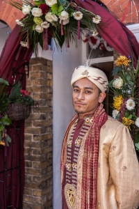
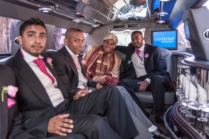
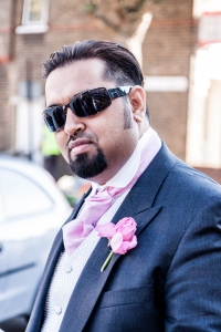
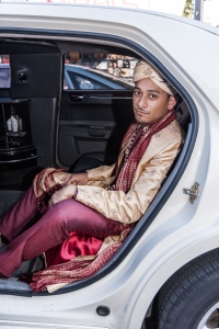
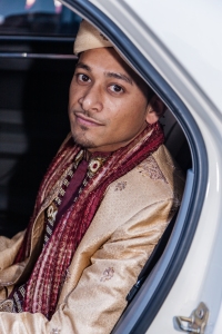
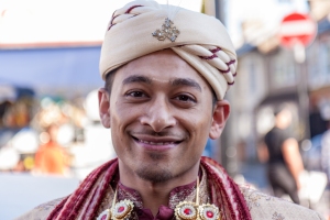
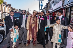
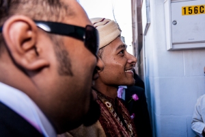
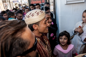
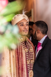
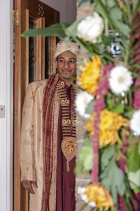
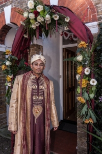
The groom is leaving for the wedding hall. I’ve tried to capture the groom in various poses to show off his beautiful gown. Indian subcontinent weddings tend to be very colourful so this is something I’ve tried to capture in these images.


A sequence of composition-13

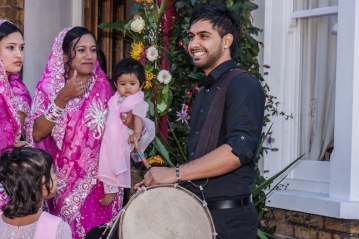
A sequence of composition-7 These images are of the groom and friends and family. The entrance to the groom’s house is traditionally decorated so I’ve tried to capture some of this. A traditional Indian dhol (drum) player has been hired for the occasion. He gets to perform at length in a later stage of the ceremonies.
A sequence of composition-1


A sequence of composition-2A sequence of composition-14


A sequence of composition-8

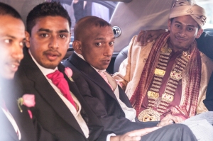
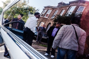
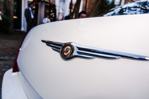
The next sequence was of various images to capture the beautiful limo that would take the groom to the hall.

A sequence of composition-9

The lavish interior of the car along with some more shiny reflections. I think this emphasises the luxurious setting.

A sequence of composition-12

I’ve captured a reflection as this is very aesthetically pleasing.

A sequence of composition-11

A sequence of composition-10

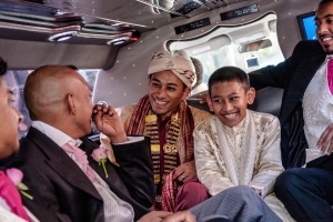
The groom shares a joke with his brother, and this is a moment they can hopefully cherish for years to come.


A sequence of composition-15

These images were of the groom’s brother-in-law and brother just before they got into their cars.

A sequence of composition-16

A sequence of composition-17

A sequence of composition-19

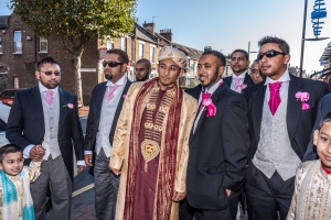
The groom as he is gets out and walks towards the hall. This also helps to capture some more of the gown. There was plenty of sunlight at the time so it was important to take advantage as it could likely be night by the time the groom leaves the venue.

A sequence of composition-18


A sequence of composition-20

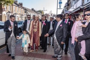
The groom and procession as they walk towards the wedding hall. I’ve tried to capture wide shots as well as telephoto. Wide shots are able to tell us a lot more about the surroundings.

A sequence of composition-23

A sequence of composition-22

A sequence of composition-21

A sequence of composition-24

A sequence of composition-25

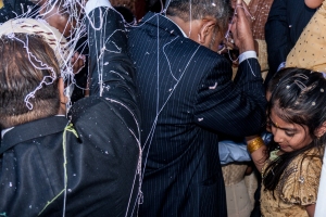
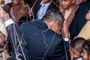
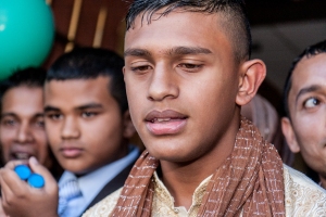
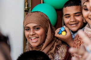
This sequence of images captures the moment when the groom tries to get into the hall. Traditionally the entrance is ‘guarded’ by children who demand payment allow entry for the groom’s entourage. After some amount of haggling a price is agreed. However, if this isn’t favourable to the children they will spray the guests with glitter and party poppers.

A sequence of composition-26

A sequence of composition-30A sequence of composition-29 This is the moment the groom and his procession got sprayed.
A sequence of composition-28

The bride’s side have children, usually cousin’s or siblings who wait armed with party poppers and spray!

A sequence of composition-27


This is just a small sequence of images from the whole of the day, but I think it serves as a way of demonstrating my intent and style of shooting. I try to obtain as much candid photos as possible, as I feel this ‘tells the story’ of the day. I generally don’t like giving directions to people as I prefer them to be as natural as possible. I like shooting weddings on occasion, but I always feel a bit nervous despite having shot about 25 weddings. I think this is a good way for me to keep focus and the pressure helps to keep me working. Perhaps some of the crops could have been better but I feel this sequence is a good general indicator of my style.

Focal lengths and different viewpoints

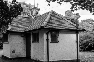
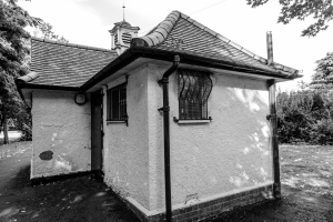
I was using the EF 24-105 lens so I had a good range from widest to telephoto. I decided to use a small building within Victoria Park as my subject.

At 105mm telephoto, I had to stand much further away. The building looks flatter and compressed. Vertical and horizontal lines look more like they should.
At 105mm telephoto, I had to stand much further away. The building looks flatter and compressed. Vertical and horizontal lines look more like they should.
At 24mm wide angle, I had to stand much closer to the building to ensure it filled the frame. This results in the those parts of the building closest to the lens to look larger. The roof and sides move away from the camera; this is known as foreshortening. The chimney has been partially blocked from view due to  foreshortening. This gives the image more depth, but horizontal and vertical lines slope away from the viewer.

At 24mm wide angle, I had to stand much closer to the building to ensure it filled the frame. This results in those parts of the building closest to the lens to look larger. The roof and sides move away from the camera; this is known as foreshortening. The chimney has been partially blocked from view due to foreshortening, and because I had to point the camera upwards. This gives the image more depth, but horizontal and vertical lines slope away from the viewer.

Focal length and angle of view

I have a full frame Canon 6D with a 24-105mm lens. This should provide a ‘standard’ view at around the 50mm mark. However, at first it seemed like I was getting this at the 70mm mark. I started thinking this may be due to the viewfinder not being 100%. With some practice and repeated shots I realised that the 50mm focal length was indeed the ‘standard’ focal length.

This is the 35mm view. As I knew this was wider than the ‘standard’ focal length, I wasn’t expecting this to look the same through the viewfinder as with the unaided eye.

This is the 50mm view.

This is the 50mm view. At first I wasn’t sure if this did indeed look the same through the viewfinder as with the unaided eye. After several practice shots and repetition, I convinced myself that it looked around the same.

This is the 70mm view.

This is the 70mm view. This isn’t too different to the 50mm view, however it is more constrained.


Assignment One – Contrast

I’ve been taking a variety of photos over the last two or three weeks with the intention of using them for this contrast assignment. Sometimes these have been experimental shots, without a definite contrast category in mind. There have been occasions where I may have taken a shot that turned out better as a different contrast altogether. This assignment has been challenging as it isn’t always obvious how to pair images as contrasts. It has also been rewarding as I’ve really discovered the merits of focussing on a theme when out shooting.

One/Many

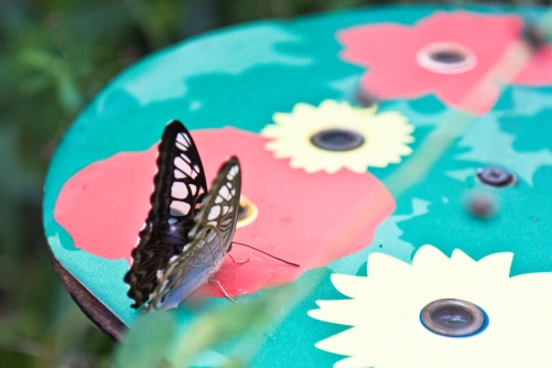
Butterfly in Kew Gardens: I found this image from the many shots I took from a trip to Kew a few weeks ago. I didn’t have this particular contrast in mind, but I had hoped some of the images would be useful for this assignment! Removing the distracting leaf in the foreground will probably improve the shot.

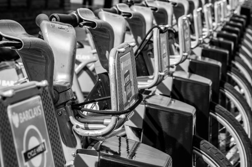
Many Boris Bikes: I used one of the shots I had taken as part of the focus assignment. The bikes seem perfect to demonstrate many items.

Many Boris Bikes: I used one of the shots I had taken as part of the focus assignment. The bikes seem perfect to demonstrate many items.


Solid/Liquid

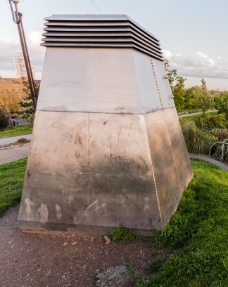
Extractor Fan: I've tried to evoke a solid feeling in this picture to the extractor fan above some shops. I thought the picture would be interesting if I kept some background interest.

Extractor Fan: I’ve tried to evoke a solid feeling in this picture to the extractor fan above some shops. I thought the picture would be interesting if I kept some background detail.


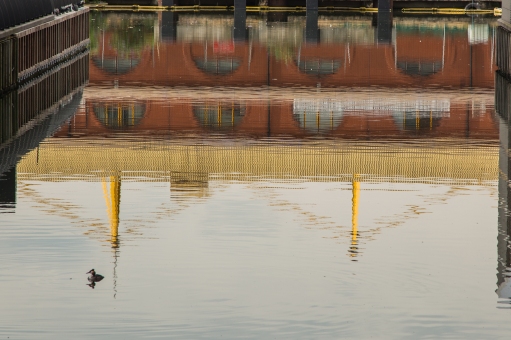
Billingsgate Market: Ive used a reflection as seen from one of the docks in Canary Wharf. I feel the bird adds to the composition as another point of interest.

Billingsgate Market: Ive used a reflection as seen from one of the docks in Canary Wharf, as I felt this was a good representation of liquid in a picture. The subject matter is also easy to identify and I felt was compelling if not original. I feel the bird adds to the composition as another point of interest.


Transparent/ Opaque

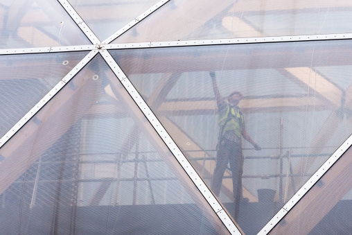
I was looking for diagonals when I came across this construction worker in Canary Wharf. There is a plastic covering in front of him that gives an almost washed out look to the picture.

I was looking for diagonals when I came across this construction worker in Canary Wharf. There is a plastic covering in front of him that gives an almost washed out look to the picture.

Contrast-9

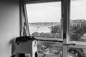
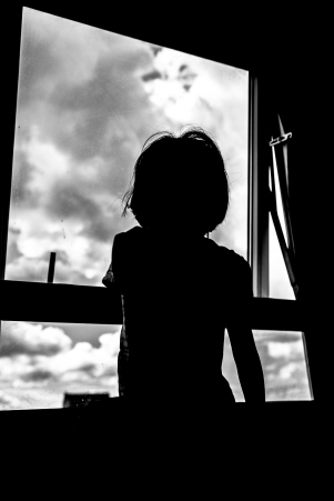
I really liked the transparent shot and wanted to keep it. I set about looking for an opaque contrast and settled on a silhouette. I waited for a break in the clouds for this picture of my daughter looking out of the window.


Straight/Curved

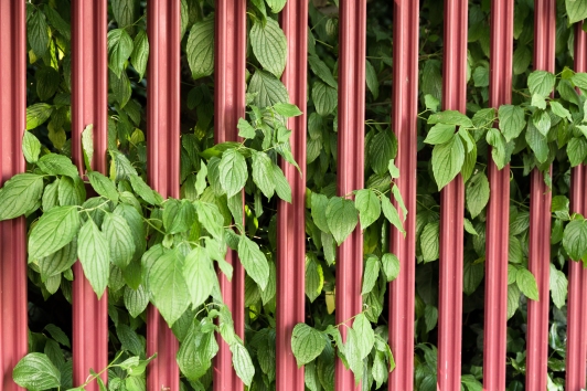
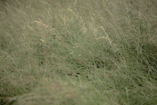
The straight lines of the fence are broken by the leaves. I also decided to keep this in colour as the red is contrasted by the green foliage.

The straight lines of the fence are broken by the leaves. I also decided to keep this in colour as the red is contrasted by the green foliage.


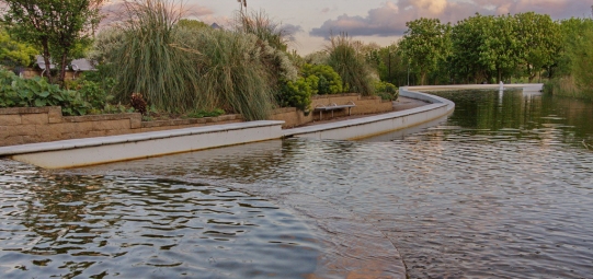
I've tried to emphasise the curved outline of this pond using a wide angled lens. I've also decided to crop the image in such a way as to follow the curve.

I’ve tried to emphasise the curved outline of this pond using a wide angled lens. I’ve also decided to crop the image in such a way as to follow the curve.

 Small/Large 

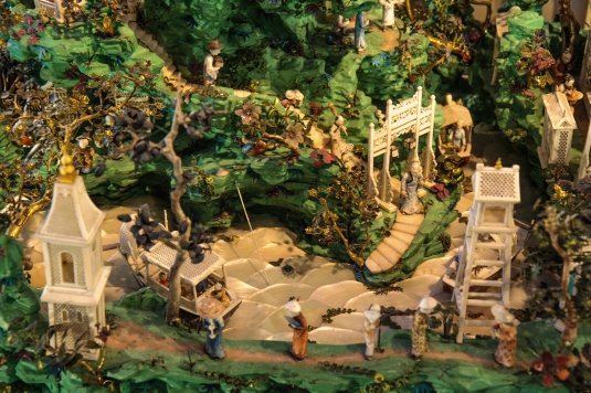
These miniature figures are from an exhibit in the Bethnal Green Museum of Childhood.

These miniature figures are from an exhibit in the Bethnal Green Museum of Childhood.


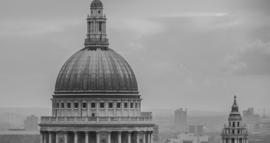
This is a view of St Paul's Cathedral from the 14th floor of a nearby office. The buildings nearby emphasise the scale. I was unable to capture the top of the dome due to space restrictions.

This is a view of St Paul’s Cathedral from the 14th floor of a nearby office. The buildings nearby emphasise the scale. I was unable to capture the top of the dome due to space restrictions. I think this reinforces the large scale of the structure as it hasn’t fit in the frame.


Hard/Soft

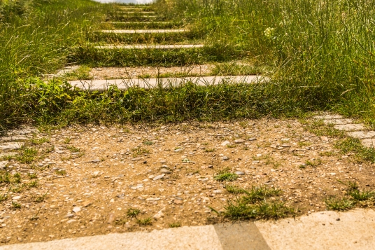
The steps have bits of gravel and dirt. I emphasised the hardness in post-processing. I have attempted to use the low perspective to make the image more interesting.

The steps have bits of gravel and dirt. I emphasised the hardness in post-processing. I have attempted to use the low perspective to make the image more interesting.


The sun was shining against the shot so this image seems washed out.

The sun was shining against the shot so this image seems washed out. The softness is emphasised by employing a shallow depth of field.

Diagonal/Rounded

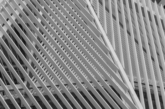
The overlapping diagonals on this structure helped to emphasise the contrast.

The overlapping diagonals on this structure helped to emphasise the contrast.


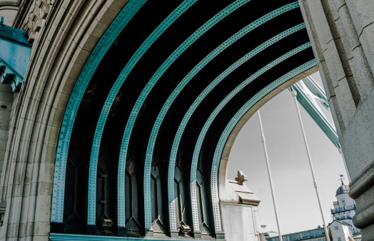
The arch at one of the Tower Bridge entrances. I tried to imply the arch rather than take a wider shot of the complete arch.

The arch at one of the Tower Bridge entrances. I tried to imply the arch rather than take a wider shot of the complete arch. I’ve tried to make the image more interesting by retaining another part of the structure at lower right.


Still/Moving

The boat in this picture is permanently anchored in this location so other boats can moor themselves if they need to. I think the black and white also emphasises the static nature of the shot.

The boat in this picture is permanently anchored in this location so other boats can moor themselves if they need to. I think the black and white also emphasises the static nature of the shot.

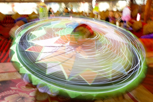
This is a Dervish performing in Nama Bay, Egypt. I think the shot encapsulates rotating movement in its purest form!

This is a Dervish performing in Nama Bay, Egypt. I think the shot encapsulates rotating movement in its purest form!


Contrast in one picture

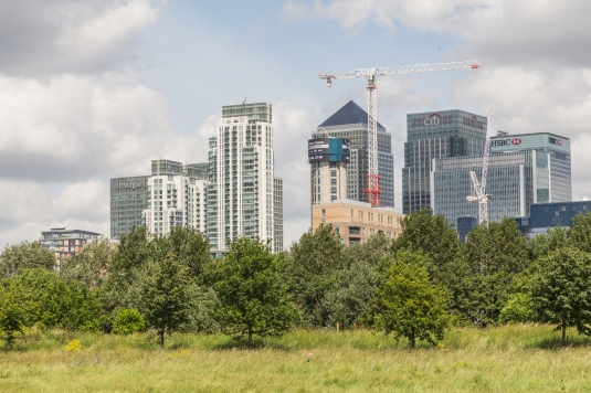
I've tried to combine the 'artificial' and 'natural' contrasts in this image. I used a telephoto setting to make the buildings look closer to the trees. The idea is that the buildings are encroaching on the natural space!

I’ve tried to combine the ‘artificial’ and ‘natural’ contrasts in this image. I used a telephoto setting to make the buildings look closer to the trees. The idea is that the buildings are encroaching on the natural space. The cranes add to the impending doom!


Fitting the frame to the subject

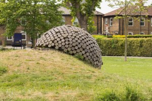
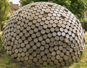
The parks in Tower Hamlets hide wonderful sculptures and murals. They make ideal subjects for photographs. I found an unusual example in Millwall Park near Mudchute Station.

My interpretation of a conventional viewpoint.

My interpretation of a conventional viewpoint.

I’ve tried to shoot this without much thought for composition, with the subject sitting right in the middle of the frame.

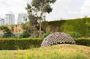
This shot was my attempt to place the subject within the context of the surrounding landscape.

This shot was my attempt to place the subject within the context of the surrounding landscape.


I’ve placed the sculpture on the right hand side of the frame, with the Canary Wharf buildings serving as a backdrop.


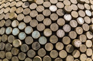
This is the detail shot.

This is the detail shot.


The sculpture provides an interesting surface so I zoomed into the detail. I felt this provided a decent opportunity for a detail shot.


The subject fits the frame exactly in this shot.

The subject fits the frame exactly in this shot.

This shot was fairly straightforward. The circular sculpture was a natural fit into a square frame.


Shutter Speeds

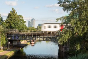
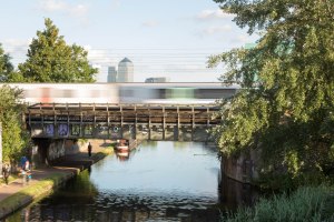
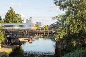
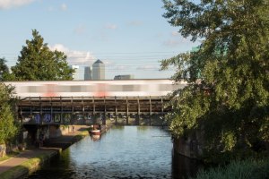
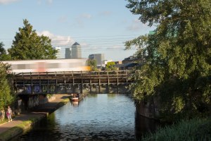
Meath Gardens is a wonderful little park in Tower Hamlets that overlooks Regents Canal. At first I had intended to go there as part of the project on ‘Fitting in the Frame’. I happened to find a railway bridge next to the footbridge which leads to the park. The footbridge was a perfect vantage point from where I could shoot the trains as they sped past. The static backdrop of Canary Wharf was distinctive, and would hopefully be a nice contrast.

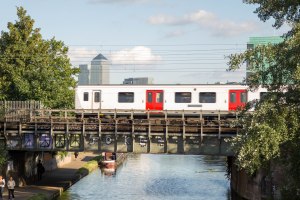
At 1/250 second: This turned out to be a boring shot. I thought the motion had been stopped but I should have increased the ISO to increase the shutter speed since I was on maximum aperture of f4.

At 1/250 second: This turned out to be a boring shot. I thought the motion had been stopped but I should have increased the ISO to increase the shutter speed since I was on maximum aperture of f4.

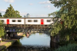
At 1/160 second the movement of the train becomes a little more interesting. The graffiti on the bridge also adds some static interest.

At 1/160 second the movement of the train becomes a little more interesting. The graffiti on the bridge also adds some static interest.

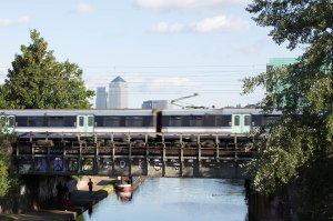
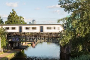
1/125 second: the motion has become more blurred and is beginning to look a little more exciting.

1/125 second: the motion has become more blurred and is beginning to look a little more exciting.

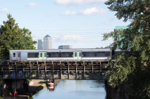
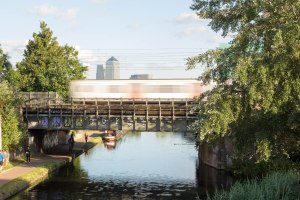
At 1/30 second, the motion has a nice, effective blur. The background and particularly the people under the bridge are starting to show motion blur. Perhaps a tripod would've come in handy.

At 1/30 second, the motion has a nice, effective blur. The background and particularly the people under the bridge are starting to show motion blur. Perhaps a tripod would’ve come in handy.

1/30 secs

1/30 secs

1/30 second

1/30 second

1/10 second

1/10 second

1/10 second

1/10 second: the cyclist’s motion is blurred, which creates a nice contrast to the aesthetically pleasing blur of the train. The slow shutter speed also helps create a streaking effect.

1/10 second

1/10 second

1/10 second

1/10 second

1/10 second: The 24-105 lens used has image stabilisation built-in, which has helped to reduce camera shake. However a tripod would’ve certainly eliminated any blur due to camera shake and allowed for lower shutter speeds. Having said that, these pictures are at the smallest aperture of the lens, so an ND filter would’ve been needed.


Focus with a set aperture

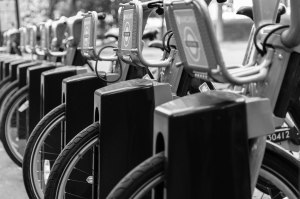
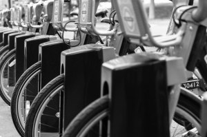
As soon as I saw the focus exercise, I remembered the many ‘Boris Bike’ Stations in London. I felt these would be perfect candidates for this exercise. I wanted to find a bike station with a full row of bikes, as this would help create a scene with a lot of depth. This was difficult probably as the bikes were in use frequently due to the nice weather. I made sure to use the widest aperture available on my lens.

Focus is away from nearest bike

Focus closer to nearest bike

Focus closer to nearest bike

Focus on nearest bike

Focus on nearest bike

I find the first image doesn’t have a place to settle the eyes once you’ve scanned from left to right. The second image is better and is arguably the best. It focuses on the second nearest bike and so allows you to scan from left to right with a point of focus in between. I quite like the last image as the basket holder on the bike in focus has been warped so is not in line with the others. This breaks the pattern somewhat and adds interest.